I think I know why. I cut my teeth on CPM (another post on CPM coming soon) and all of my lessons were pre packaged. All I needed to learn was to ask good questions and get out of the way. That suited my style very well. By the time NCLB came around and we dropped CPM, my school was already going lock step with pacing guides and common assessments. Neither one of these approaches allowed for much innovation nor did they require a bunch of thought. It didn't help that I became the varsity baseball coach in my first full year of teaching and spent way more time planning practice than I did lessons. The real problem was that I didn't really know how much I had bitten off until recently.
Now that I am teaching middle school math as the high school guy brought in to handle all the GATE kids, I am not only responsible for my own classes but for setting a tone and pace for an entire department. I feel more accountability now than ever before. It has been in these last three years that I have really started to ask reflective questions regarding not only my practice, but good practice in general. I also have access to tools that I didn't even know existed when I was at the high school.
So here is a snapshot of where my lessons were compared to where they are. Feel free to take your shots and help me make this better. This lesson is stolen borrowed adapted from a lesson in the April 2009 issue of Mathematics Teaching in the Middle School.
What I would have done before:
I don't know if I would have even bothered to re type the lesson, I may have just photo copied it and given it like this:

I would have passed out this handout and told the students to represent each savings plan as a: graph, input/output table, algebraic expression and verbal expression. My students would have muddled through it and most would have just jumped through another hoop.
What I did today:
I toggled between these four slides and asked students to pick out what information they thought was important. It was interesting that some students felt it necessary to try to copy the information while the rest of the class was willing to observe and jot down what they thought was essential info.
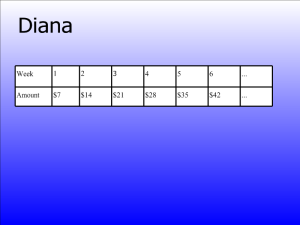
Questions students came up with:
- Does the chart represent the amount of money Diana makes each week or the total she has saved?
- Will she continue to save at this rate? "Yeah, look at the "dot, dot, dot."

Teacher: "What can you tell me about Yoni?"
Class: "She has $300."
Teacher: "How much will she have in 3 weeks? 2 years? 100 years?
Class: "$300. $300. $300."
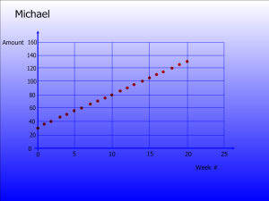
A few students were quick to point out that we only needed to focus on two or three key points in order to make a generalization of Michael's situation. They immediately zoomed in on (0, 30) and (10, 80). However, I did have one group who decided to focus on the last point (20, 130). They decided that Michael averaged $6.50 per week. But when they were asked if their trend would continue, they quickly realized that they had failed to consider the original amount of Michael's savings.

Chandler, one of my 7th graders decided to ask, "Does x represent weeks?" Beautiful, that info was on the next slide.
The question of the day had to come from Paul: "So, if the only point we know for sure in Michael's graph is (30, 80) wouldn't he have more money if he actually started at (0,0)? In his mind he was seeing this...
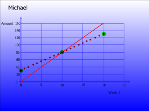
...which led to an interesting discussion on how slope represents the amount of money saved per week.
My students are starting to catch on to how things work in my class because as soon as these slides came up:
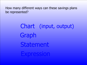
I asked, "What is my next question?" To which they all responded:
Once they had made the decision on which represenation they prefered, I had them represent the other three savings plans the same way.
At first the justifications for "why" one representation was preferred over another were weak at best, lazy and unthoughtful at worst:
- An input/output table is more organized.
- It's easier to see the data.
- I like it better because it is better and less worse than the others.
Okay, that last one was mine, but you get the point. Being the father of four boys, I can smell an "alright get off my back, already" answer a mile away, I continued to prod. Eventually we had answers like this:
- I prefer the chart because it is easier to see which numbers go together; on the graph, you have to work a little more to see which numbers are related.
- I prefer the graph because I can actually see how the different points relate. The slope helps me see how fast someone is saving.
- I prefer the verbal expression because it helps me understand the overall situation better.
We eventually got to the discussion on "Who has the most money right now?"
Hands fly upright around the same time I hear: "Yoni! Danny!"
Then Adrian pipes up, "When is now?"
Gotta love that kid!
I have one easy suggestion, don't do blue type on a progressively blue-er background. It gets hard to see at the bottom. Pick colors that contrast well, it should be easy to read.
ReplyDeleteDefinitely seems more engaging. I was busting butt to do presentations at the beginning of the year, but I like GeoGebra sooooooooo much. You can have a pre-pared file, or start from scratch, it might have made your student's point about saving from (0,0) easy to show with precision in class. I found it really useful for having kids do some graphing today - having them come up to the computer and click the two points they found on their graph and having geogebra plot the line. Having seen your farm geogebra, you know it way better than I do, why not use it instead of the graph slide?
I noticed the blue problem when I posted the slides, but for some reason there is plenty of contrast in my classroom. I have skylights right over my SMART Board so using a white background is pretty glaring.
ReplyDeleteI just started using GeoGebra this year and Dr. Fahlberg-Stojanovska has been a great resource. I love that program as well. You might be right about having the GeoGebra fired up and ready to go. Do you think that it would hurt the flow if I went from Smart to GeoGebra?
I do it quite a bit. But it does tie you to the computer. I've started sending kids up to do stuff on GeoGebra. Anything they did on paper if it involves graphing should be pretty easy for them to transfer to GeoGebra with just some basic instructions from you on the tool etc. I was almost even wondering why not make a static graph image in geogebra. Cheers.
ReplyDeleteLast year, I started using a wireless tablet with my SMARTBoard and I really enjoy that. It allows me to do a lot of the things at the board, but I can move around. It is kind of the best of both worlds.
ReplyDelete